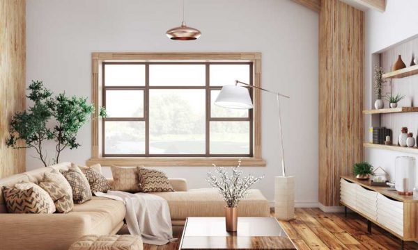
Start by choosing two or three dominant hues that reflect your style, using color theory to achieve harmony—think opposites or tonal variations for modern impact. Map out geometric layouts on walls, taping clean lines for a sharp, professional look, and balance everything with grounded neutrals or crisp trims. Anchor bold contrasts through statement furniture and striking accessories, layering textures to draw the eye. For expert tips on placement, finishes, and advanced styling, keep exploring.
Key Takeaways
- Choose two or three dominant hues and coordinate them using color theory for a harmonious, intentional palette.
- Plan your color block layout with sketches, considering wall placement, scale, and the room’s natural light.
- Use painter’s tape and a level to create crisp, geometric boundaries when applying paint to walls.
- Introduce bold-colored furniture or accessories, like rugs and pillows, to reinforce your palette and add visual interest.
- Balance vibrant colors with neutrals or natural textures to prevent the space from feeling overwhelming.
Choosing Your Color Palette
Start with two or three dominant hues that capture the mood you want to evoke—think energizing primaries, soothing pastels, or sophisticated jewel tones.
Leverage color theory to guarantee your selections work harmoniously; complementary or analogous schemes can maximize both cohesion and contrast.
Consider the emotional impact of each color: blues and greens tend to calm, while reds and yellows energize.
Don’t just follow fleeting trends—select shades that resonate with your personality and the atmosphere you want to create.
Bold, saturated fields can make a space feel dynamic, while muted tones evoke tranquility.
To maintain visual balance, integrate neutrals or off-whites as a buffer between striking blocks.
With intentional choices, your color palette becomes the foundation for impactful, on-trend color blocking.
Planning Your Color Block Layout
Before you pick up a paintbrush, map out your color block layout with precision—three key factors shape the outcome: scale, placement, and proportion.
Analyze your space to determine which walls or architectural features will serve as your canvas. For layout inspiration, look to contemporary interiors that juxtapose geometric shapes—arcs, rectangles, or organic forms—with negative space for a striking effect.
Use color block techniques like asymmetrical division or bold banding to guide the eye and accentuate focal points. Sketch your design digitally or on paper, adjusting line weights and intersections to guarantee visual harmony.
Consider how each block interacts with natural light and adjacent furnishings. Strategic planning empowers you to execute a balanced, trend-forward color block layout tailored to your unique space.
Applying Color Blocking to Walls
Once your layout is finalized, precise execution transforms your vision into a dynamic statement wall.
Begin by meticulously measuring and taping off your design, ensuring crisp, geometric boundaries that define the color-blocked zones. Opt for high-quality wall paint in bold accent colors that reflect current trends—think saturated emerald, terracotta, or sophisticated navy.
Use a level to maintain symmetry and clean lines, which are essential for a professional finish. Apply multiple thin coats of paint for even saturation, allowing ample drying time between layers.
Don’t hesitate to juxtapose matte and gloss finishes for added visual intrigue. By thoughtfully layering accent colors, you’ll create striking depth and architectural interest that elevates your space.
This approach guarantees a modern, gallery-worthy wall that commands attention.
Incorporating Color Blocking Through Furniture and Accessories
Statement pieces—such as a cobalt velvet sofa, a pair of lacquered side tables, or a sculptural yellow accent chair—anchor color blocking beyond the walls, infusing your space with intentional vibrancy.
To master this trend, curate your furniture arrangements so each item acts as a deliberate color focal point. Place contrasting hues in proximity to amplify visual tension and depth, like an emerald credenza beneath a magenta lamp.
When it comes to accessory selection, opt for geometric rugs, bold throw pillows, and color-dipped ceramics to reinforce your palette. Layering these chromatic accents guarantees the eye travels seamlessly across the room, celebrating each zone.
Balancing Boldness With Neutrals
While bold, saturated hues energize a space, integrating neutrals guarantees your color blocking reads intentional rather than overwhelming. You’ll want to use color psychology to your advantage—pairing bold combinations with neutral tones like crisp white, soft gray, or warm beige to ground the energy and provide visual relief.
This balance allows vibrant zones to pop without clashing or causing visual fatigue. In today’s trend landscape, interiors that layer saturated colors with neutral backdrops appear curated and sophisticated, not chaotic.
- Use neutral walls or floors as a canvas for bold color-blocked furniture or art.
- Introduce natural textures—wood, linen, or stone—to soften intense color blocks.
- Frame bold combinations with black or white trim for crisp definition.
- Anchor saturated palettes with oversized neutral rugs or minimalist accessories.
Conclusion
With color blocking, you’ll transform your interiors into curated, visually striking spaces. By selecting a cohesive palette and thoughtfully layering bold tones with neutrals, you’ll create dynamic focal points and celebrate architectural lines. Whether painted walls or statement furniture, color blocking keeps your home on-trend and editorial. Lean into contrast, balance, and creativity—your space will exude sophistication and contemporary flair. Don’t hesitate to experiment; the right color block can redefine your entire design narrative.