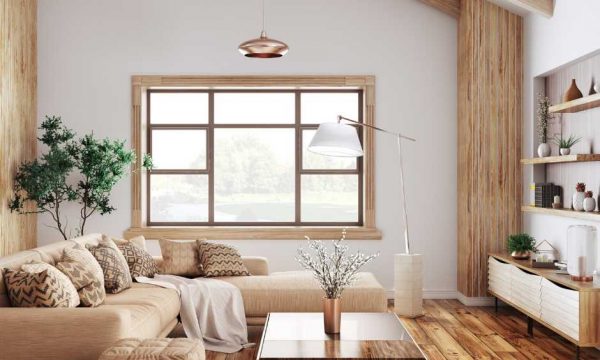
To mix patterns in your home like a designer, start with a cohesive color palette—limit it to two or three core hues for harmony. Layer varying pattern scales, pairing bold motifs with smaller prints, and use solid fabrics to ground busy designs. Add tactile depth with mixed textures like velvet or linen, and always weave in a unifying element, such as a repeated shape or accent color. Keep going for sophisticated strategies and on-trend inspiration that elevate every room.
Key Takeaways
- Choose a cohesive color palette and repeat its shades throughout all patterned elements for visual harmony.
- Mix patterns of different scales, such as combining large motifs with smaller prints, to create balanced contrast.
- Pair busy prints with solid-colored furnishings to ground the design and avoid overwhelming the space.
- Layer various textures, like velvet and linen, alongside patterns to add depth and interest to the room.
- Use a unifying element, such as a recurring color or motif, to tie together mixed patterns seamlessly.
Start With a Cohesive Color Palette
When you’re ready to layer patterns, anchoring your space with a cohesive color palette is essential. Start by selecting two or three core hues that establish color harmony throughout the room. These foundation shades will act as visual connectors, allowing bold motifs or subtle prints to coexist seamlessly.
For expert pattern coordination, pull accent tones from your primary palette into each patterned element—think throw pillows, rugs, or drapes. This unified approach prevents visual chaos and achieves a curated, designer-quality look. Pay attention to undertones as well; mixing cool and warm palettes can feel disjointed.
Trending interiors often rely on monochromatic schemes or analogous colors for effortless pattern layering. When you commit to color harmony, you’ll have creative freedom to experiment confidently with diverse prints.
Vary the Scale of Patterns
A balanced mix of pattern scales transforms your home from visually flat to dynamically layered. When you layer large-scale motifs—think oversized florals or bold geometrics—with medium and small prints, you create scale contrast that draws the eye and prevents visual monotony.
Don’t hesitate to pair an expansive damask wallpaper with a finely patterned throw; this interplay guarantees pattern harmony while maintaining a curated, on-trend aesthetic. The secret is intentional variation: anchor the room with one dominant, large-scale pattern, then echo its colors or motifs in subtler, smaller-scale designs.
This method keeps the overall look cohesive but visually exciting. By mastering scale contrast, you’ll curate a space that feels sophisticated and thoughtfully designed, reflecting a confident grasp of interior design trends.
Balance Busy Prints With Solids
While it’s tempting to layer multiple bold patterns, savvy designers know that grounding busy prints with solid hues is essential for visual equilibrium.
When you introduce pattern combinations—florals, geometrics, or abstract motifs—pair them with blocks of color to create a sense of visual harmony. Solid upholstery, curtains, or rugs act as a calming canvas, letting statement prints shine without overwhelming your space.
Choose solids that echo a color from your patterns for a cohesive, curated effect. This strategic contrast is a hallmark of contemporary interiors, ensuring your rooms feel inviting rather than chaotic.
Don’t be afraid to use negative space; it’s as impactful as the patterns themselves. By balancing busy prints with solids, you’ll achieve a well-edited, modern, and stylish home.
Layer Textures for Added Depth
Nothing elevates a room’s design like the interplay of layered textures. When you’re mixing patterns, consider how textile combinations—think nubby bouclé, sleek velvet, or crisp linen—can bring nuance and visual interest to your space.
It’s not just about pattern-on-pattern; it’s about how a chunky knit throw, smooth silk pillows, or a woven jute rug add tactile dimension that draws the eye and invites touch. Designers are gravitating toward tactile diversity, pairing organic textures with modern prints for a curated, on-trend feel.
Layering textures breaks up pattern intensity and grounds your design, preventing visual chaos. Mix materials with intention, letting each surface play a distinct role. This mindful approach guarantees your space feels dynamic and expertly balanced, not overwhelming.
Incorporate a Unifying Element
Once you’ve curated a dynamic interplay of textures, anchoring your design with a unifying element keeps the look cohesive.
To masterfully mix patterns, identify a unifying motif—such as a repeating color, geometric shape, or botanical theme—that subtly echoes throughout your space. This expert technique prevents visual chaos and allows you to confidently layer contrasting styles, from bold florals to intricate stripes.
For example, if your primary palette features indigo, weave it through rugs, cushions, or art for seamless unity. Consider trending elements like organic curves or metallic accents as your thread of continuity.
Conclusion
By curating a harmonious color palette and playing with scale, you’ll master the art of pattern mixing like a pro. Remember, juxtapose bold geometrics with subtle florals and anchor the look with solids or tactile textures—think velvet, bouclé, or linen. Cohesion comes from a unifying motif or hue, so your space feels intentional, not chaotic. Don’t be afraid to embrace maximalism; it’s a top trend. Your home should reflect your unique aesthetic confidence.